Animation Styles in Spider-Man: Across the Spider-Verse
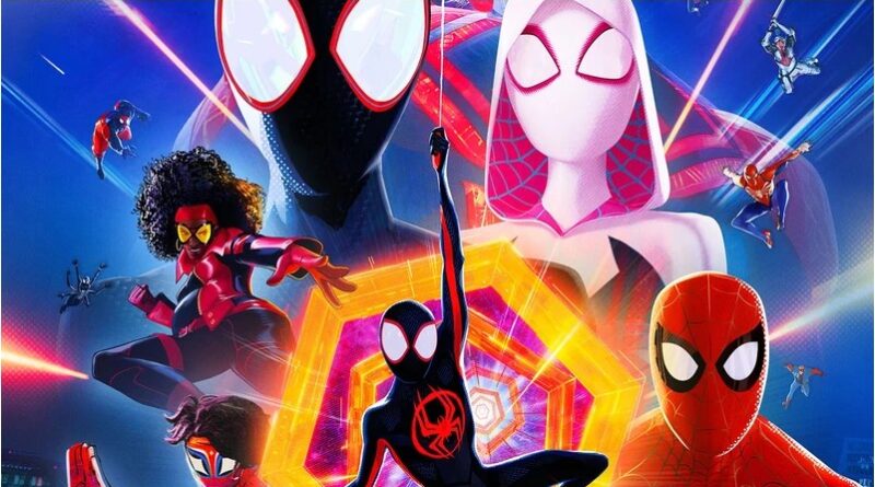
Spider-Man: Across the Spider-Verse features various animation styles, all of which are combined to create several characters and locations throughout the Spider-Verse. Into the Spider-Verse’s animation style has changed the animation game once again, and now serves as an inspiration to new cinematography. Let’s explore some techniques that led to this!
Miles’ Original Universe:
Gwen Stacy’s Earth-65 was the first Spider-Man: Across the Spider-Verse universe to appear in the movie. But, as soon as Gwen’s prologue ended, Across the Spider-Verse returned to its original animation style from Spider-Man: Into the Spider-Verse. Miles is still animated on twos, which means that for each second of animation, there are 12 new frames or “drawings”. This allows him to move smoothly throughout the film and simultaneously stay true to the “comic-book” style and way of moving as well. During Miles’ fight scenes with The Spot, there was no motion blur used during large movements. There were only large streaks of textured color, which further emphasized the comic-book style of animation. The combination of 3D and 2D during the film allowed for wider shots featuring multiple characters, which usually reflected conflicting or stressed emotions between the characters, especially Miles.
Spider Punk:
Hobie Brown, aka Spider-Punk, is another Spider-Person who got their own unique animated world in Across the Spider-Verse. Characterized as rebellious, Spider-Punk’s animation style was quite different compared to the rest of the Spider-People. According to Across the Spider-Verse directors Kemp Powers, Joaquim dos Santos, and Justin K. Thompson, the idea was for Spider-Punk to feel “hand cut, pasted, drawn, glued together”. This is why Hobie was animated on threes, which means that for each second of animation there are 8 new frames or “drawings.” Joaquim Dos Santos also said that Spider-Punk’s jacket is often animated at a “different frame rate” from the rest of the character, which is not easy to achieve. This resulted in a more choppy look throughout the film, and further demonstrated the “punk rock” look that the directors wanted to achieve. Besides characterizing Hobie, this style of animation helped to add a varied nuance to the film, allowing for the audience to really connect and understand each of the varied Spider-People.
Spider Gwen:
Spider-Man: Across the Spider-Verse opens by showing Gwen Stacy’s story, displaying moments from before and after Gwen met Miles. Described by Across the Spider-Verse producers Phill Lord and Christopher Miller as a “mood ring,” the colors in Gwen Stacy’s universe changes to reflect her emotions. For example, when she first hugs her dad during the beginning of the film, the pastel dark and light blues change to warm pinks and oranges. Gwen’s world also utilizes more water color techniques in both the foreground and the background, which emphasizes a focus on Gwen rather than the environment around her. Oftentimes as Gwen makes an important decision, such as getting the “band” back together to save Miles near the end of the film, the colors begin bleeding into one another in the background, showing how Gwen enters a new Spider-Woman phase.
Spider-Man 2099:
Spider-Man 2099, aka Miguel O’Hara, is one of the main Spider-Man variants in Across the Spider-Verse, serving as a complex antagonist in regards to Miles Morales. Miguel’s animation style is heavily based on futuristic technology, which lead to him being animated on ones. This means that for each second of animation, there were 24 new frames for Miguel’s movements. This allowed Miguel to move the most smoothly throughout the film, reflecting his access to advanced technology and emphasizing how his character is essential in the Spider-Verse. Instead of organic webs, Miguel uses tech-based, glowing web shooters as he fights, which shows just how long he’s been trying to keep all of the multiverse intact and in order. Miguel is often surrounded by dark and ominous colors, some of which glow, and some of which are matte. These colors are juxtaposed on Miguel’s suit, and I personally believe that it’s supposed to reflect his own internal conflict of coming to terms with messing with a canon event, which resulted in the loss of his daughter.
Overall, I think that this is definitely going in my personal top 5 movies of all time list. I absolutely love the color-grading, the animation, and the storyline for the Spider-Verse movies so far, and I can’t wait to see what’s next for Miles Morales!
For more of Siya’s work at FANgirl Blog, click here. For more on the animation styles check out this cool video on the Making of Spider-Man: Across the Spider-Verse:
- Clues from LOKI Season 2 - October 20, 2023
- Animation Styles in Spider-Man: Across the Spider-Verse - July 4, 2023
- What Ant-Man & the Wasp: Quantumania End Credits Set Up - March 9, 2023


